as One of portland’s premiere food festivals, taste was in need of branding that could pack a punch. a dash of whimsical and a measure of mischief brought things all together for a punchy, pattern heavy, brand that spoke foodie yet still looked polished.
Art Direction
Illustration
Logo Design

part of my role for this client was Illustrating dozens of food items. then, I created repeating patterns out of those illustrations to be used as branded elements across the various collateral pieces.


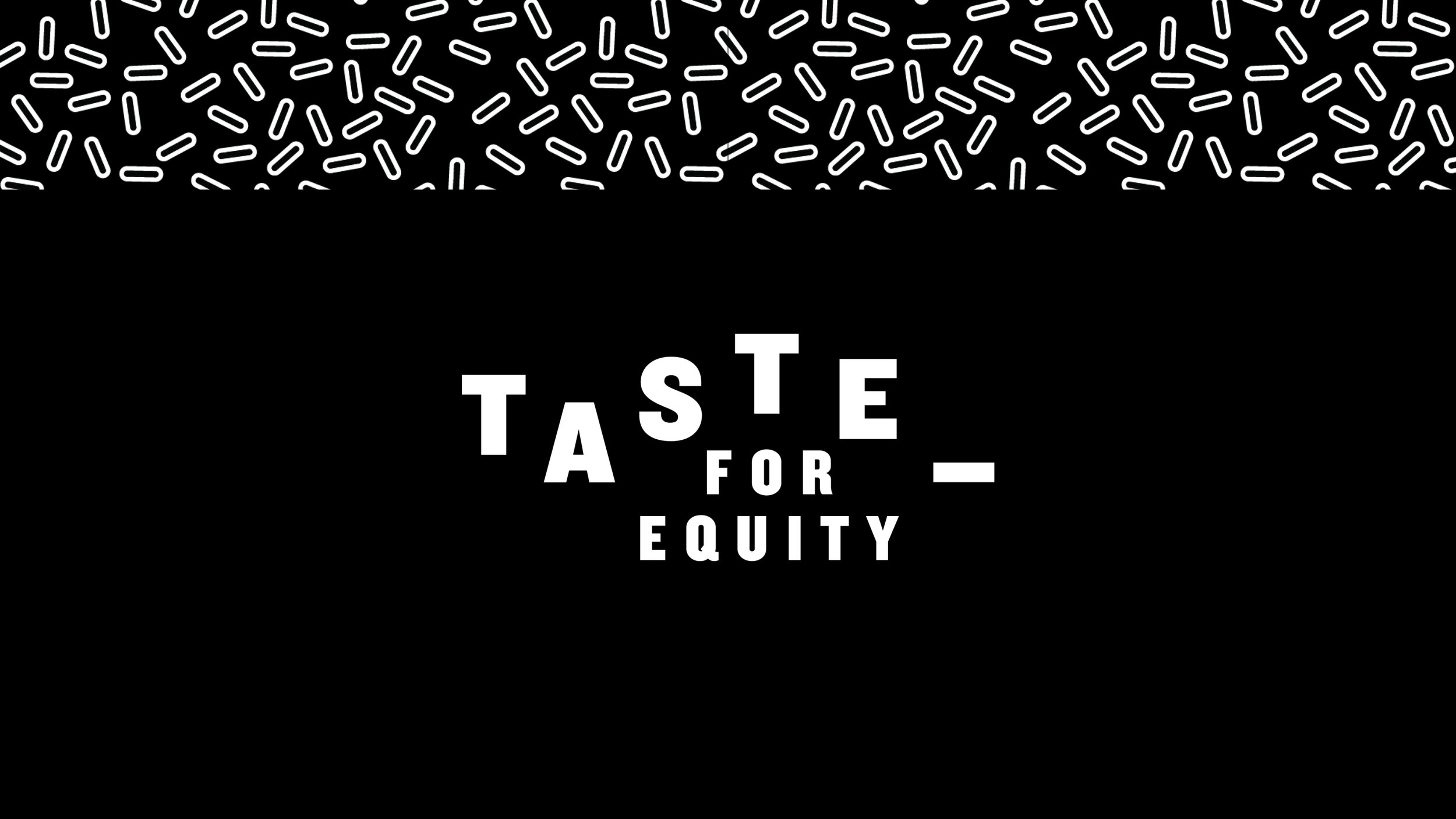
Another project that I took on, was updating the logo to include the brand’s renewed focus on building equitable communities in Portland. I pursued two concepts with this exploration.
First on the left: bringing everyone around for a shared experience and shared meal. The surrounding text represents the dinner plate and the Taste wordmark is the meal and vessel to promote and engage the equity building process.
The second concept was thinking of the Taste wordmark, with all it’s gaps and negative spaces, as a metaphor and what we are trying to do is think of those spaces as small opportunities to fill with equity. This concept was chosen and is highlighted in the center here.
Contributors
Angie Maurer
Becca Pierpoint