As a designer on the nike account, I had the pleasure of working across the gamut of Nike’s digital touchpoints. From countless emails, thousands of banner ads, and hundreds social posts to creating content for the nike website and the nike apps, I designed for pretty much everything. Below are some of the projects I enjoyed most in my years on the account.
Nike Refurbished
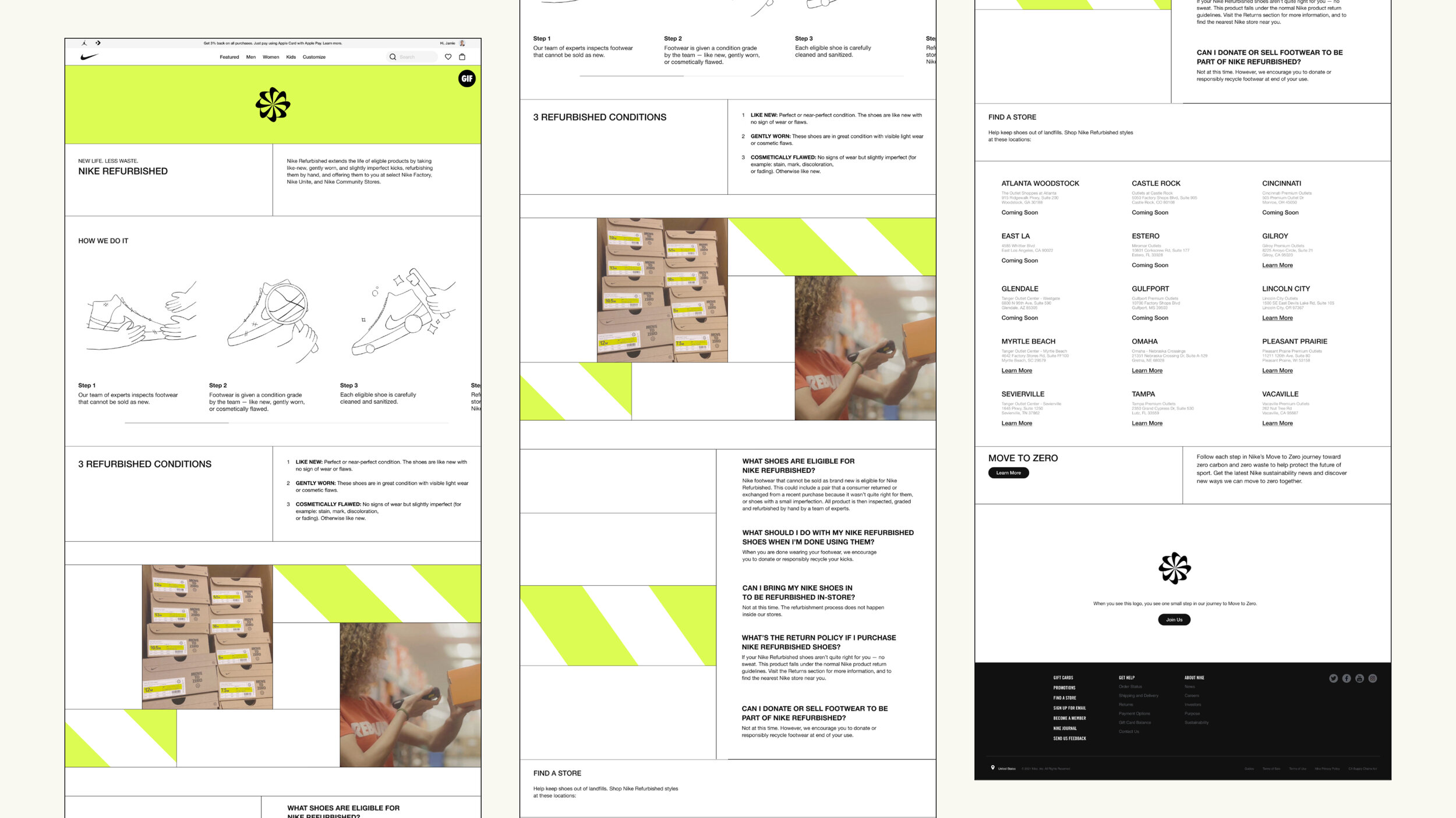
The Nike Refurbished page was an interesting project as it falls in their “Move to Zero” campaign and therefore is branded in that same way. The Volt Green and caution bars, and gridded, Mondrian-esque divisions, were very different than a normal Nike webpage, and were certainly a bit of a challenge to get right in development, but the result is fantastic and the idea of creating a more sustainable economy is beyond admirable.
Check out the live page here.
Nike in-store benefits
The Nike In-Store Benefits page, while a bit less wild than the refurbished page, was super fun to design. The page is intended to draw people into the stores after they’d been closed because of the global pandemic. It highlights the benefits of using the app and the various ways you can easily link into the Nike ecosystem to make shopping a breeze. The one challenge I did run into while designing this page was the threadbare brief. I had only a few images to choose from and a general idea of where to go and was set loose. The results are a beautiful, functional, and informative site which you can check out here.
Nike App & Email Design
Design kits for the Nike SNKRS App (Right) and Nike App (Below).
(Far below) Design and motion work for a Nike product launch email.
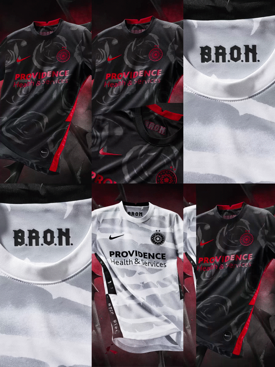
Motion graphics work highlighting the home and away jerseys for the Portland Thorns jersey launch.


